Death By Ninja - Big Update!


Out on Google Play
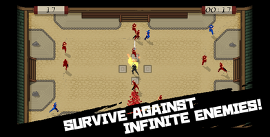
Death by Ninja has now been released on the Google Play Store. Originally as a game jam title we made in order to revitalize our creative spirits we have now polished the results into a game worthy of being published.
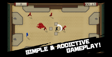
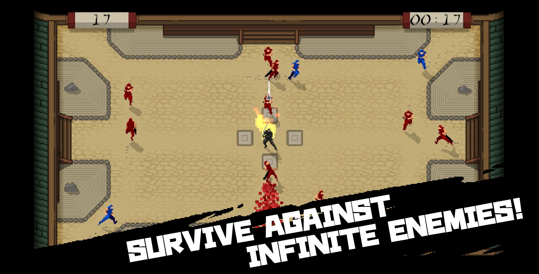
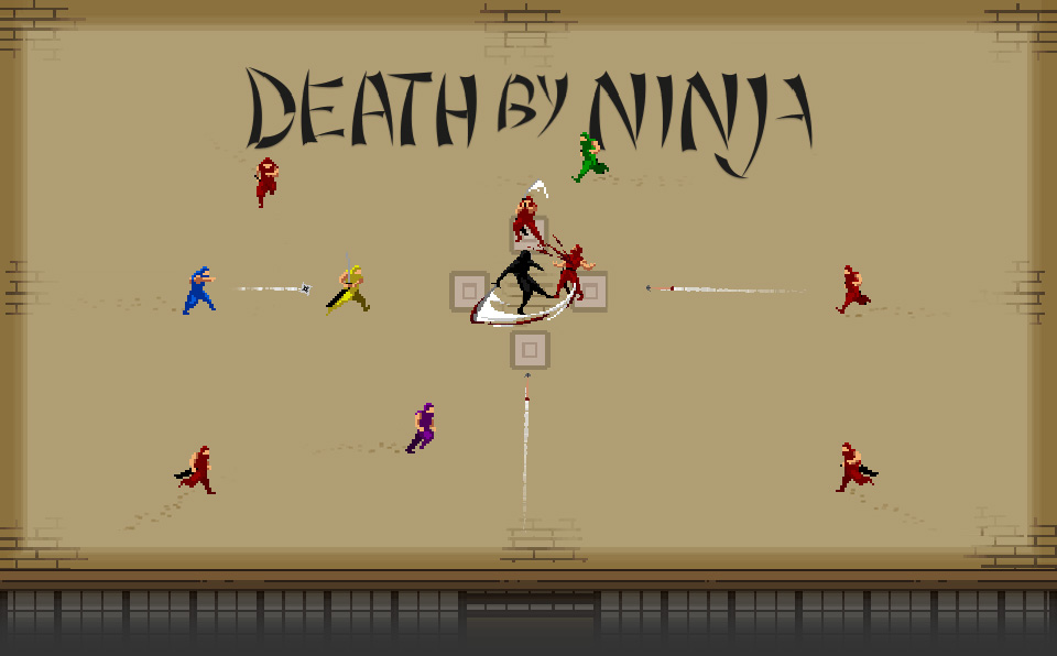
Death by Ninja is a game where you must fight off an endless onslaught of ninjas in order to battle for your survival. The game sends endless waves of ninjas at you which you must defend yourself from, using a simple control scheme of W,A,S,D. In essence the game plays as a reaction based rhythm game, however with the AI not always deciding to attack you there is a sense of random and suspense that lingers around the player.
Together with the release of the android version for this game and with the planned release onto iOS we have also updated and added features to the game. We thought of these features during the jam but at the time we couldn't add them due to time constraints.
NEW MAPS
From the original single map where the player could fight for their survival we have now added two new maps and graphically updated the original. These new maps add a layer of difficulty for the player in unique and interesting ways.
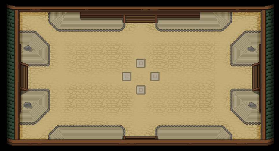
The first (original) map is a symmetrical layout with 100% line of sight. This is a perfect place for players to learn the basics of the game and a practice area in order to improve their reactions.
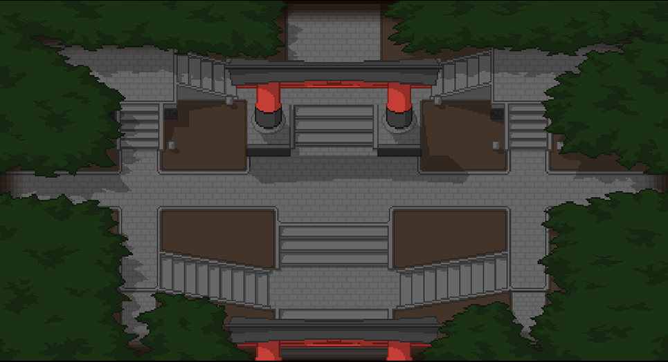
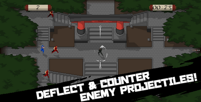
The second map (Temple) adds an element of asymmetry into the mix and introduces a small barrier to the players line of sight. With the asymmetry the enemies and projectiles will have different distances to travel depending on where they are coming from which means the player must now account for an increased variation of threats. The line of sight being blocked by certain buildings makes it difficult for the player to assess all the threats.
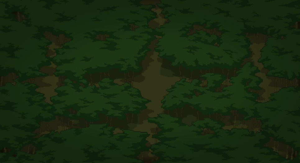
The third map (Forest) adds a large barrier to the players line of sight, with the enemies running beneath the forest. We found this to greatly increase the suspense of the game as your reactions must now be sharper to not get killed by a surprise.
Together we feel these three maps add a nice variation to a game which promotes replayability. The maps are unlockables requiring the player to reach a certain rank in the previous level in order to play the next.
NEW ABILITIES
Another feature added to the mobile release of the game is the addition of the Ninjas new ability, A fan of knifes.
This ability is gained once the player has reached a combo of 10 enemy or projectile hits without missing. The ability gets stronger every consecutive 10 hits until the player decides to use the ability.
The progression of the ability is as follows:
- 10 hits – 4 Knives thrown (in 4 directions)
- 20 hits – 8 knives thrown (now in 8 directions)
- 30 hits – 16 knives thrown (two knives in each direction)
- 40 hits – 24 knives thrown (three knives in each direction)
- 50 hits – 32 knives thrown (four knives in each direction)
We added the ability because we wanted to reward players that focused on accuracy and not button smashing. However we didn’t want to remove the possibility to button smash as this would inevitably reduce the responsiveness of the game and worsen the experience. Therefore with this new ability we reward those who don’t button smash but leave the option in there. Overall this ability has created a completely new play style to the game which we feel is great and should add the to the experience as a whole.
POLISH POLISH AND MORE POLISH
Since we would be releasing for mobile, and thereby would be showing Ad’s and offering the ability to remove Ad’s via a single in app purchase, we felt the game must be polished to a degree where the consumer won’t feel the experience cheapened by any rough edges. Due to that we worked on polishing the game as a whole, and focused on some key areas.
UI
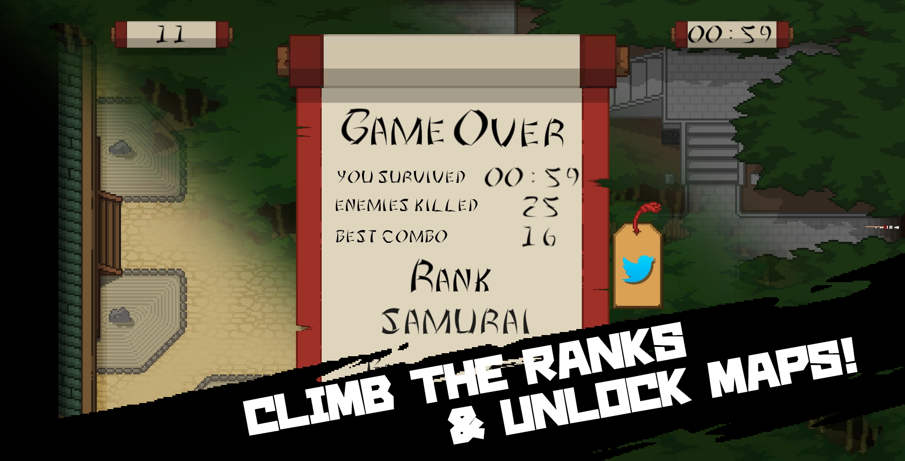
We gave the UI a complete overhaul. The original UI was a quick and dirty implementation due to the time constraints, however since we now had time we decided to redo the whole aesthetic. We went for a scroll based theme as we felt this fit the games theme quite well. With this we added unique SFX and animations for navigating the UI and worked on making the navigation as intuitive as possible.
VISUALS
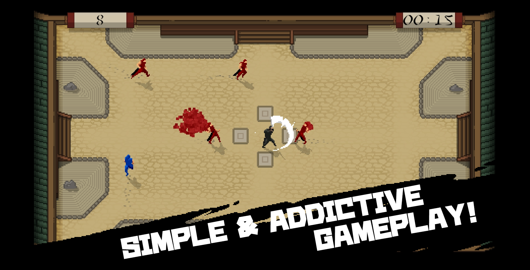
One aspect we very much wanted to get done in the game jam but just didn’t have time for was shadows for the characters. Originally we looked into generating the shadows in real-time as a quick solution however this never worked as intended. This left us with the option of baking the shadows into the sprite animations which we didn’t have time for.
So… What a perfect opportunity to do that now! and so.. we did. All characters have been updated with shadows which we feel really adds to the visual aesthetic of the game. While working on updating these sprite-sheets with shadows we also decided to polish the slash animations of the character in order to make them feel as snappy as possible.
SOUND
With the addition of the new UI and the new visuals we felt it was also important to get accompanying audio for these. So we worked on some new SFX in order to make the overall experience feel high quality and polished. The SFX were created in-house with us standing in front of the microphone with many strange objects. Most notably is the abilities SFX which was created using a fast food chains balloon holder we happened to have lying around.
BALANCE
The final yet the most important part of our polishing was the polish done to the balance of the game. With the push to mobile we had to take into consideration that reaction speeds will vary from keyboards to touch devices. We, also having received much feedback from the online community with the Game Jam version, felt it important to tweak some small aspects of the game, such as attack durations and certain collider sizes. All in all we feel that the tweaks made have really tightened the experience and made the game feel more responsive and snappy.

Leave a comment
Log in with itch.io to leave a comment.